

Online Strategies
What is a Lead Magnet. Examples and meaning
Users come to your website for different reasons, so it's important to keep in mind that the welcome cannot be the same for everyone, but we must adapt to their specific needs.
That's why in this post I'm going to share with you a list of examples of landing pages that reflect these differences very well according to the objectives set, while providing a great user experience.
First, it should be clarified that a landing page performs a different function than the home page of a website, which serves to publicize the brand in a more general way. The landing page —also called landing page or landing page— is a web page aimed at a specific visitor profile with the objective of capturing their attention and leading them to perform a specific action, such as filling out a contact form, making a purchase or subscribing to a newsletter.
Before showing you the examples, we'll look at some characteristics that most successful landing pages share, such as:
**1. Clear and concise value proposition: ** Located at the top of the landing page, this information directly and clearly shows the purpose of your page.
**2. Consistency in the texts: ** Make sure that the main title of your page matches the publication that the visitor clicked to get there, or the call-to-action (CTA) button in the email.
**3. Social presence: ** Include opinions, testimonials, success stories or customer logos that support and lend credibility to your statements and generate the necessary trust in your visitors.
**4. Clear and effective calls to action: ** Focus your entire page on a single objective and present a single main call to action (such as subscribing, buying or more information) and place them in strategic areas throughout the page.
**5. Attractive, conversion-focused design: ** Create a design that highlights your CTAs, values the use of white space, bright colors, contrast and indications, to guide the user to the goal. In addition, using high-quality images, videos or graphics that complement the message and attract their attention is another good practice.
**6. Easy navigation: ** Simple, minimalist design that eliminates noise or distractions and points out an easy path for the user to convert without offering too many alternative navigation options.
**7. A/B Test: ** It is interesting to always test new ideas through A/B Testing with users, since it will help us discover the options that work best, often obtaining surprising results.
Once we have seen the common points of landing pages that obtain a high level of conversion, I will offer you a list with examples that can help you:
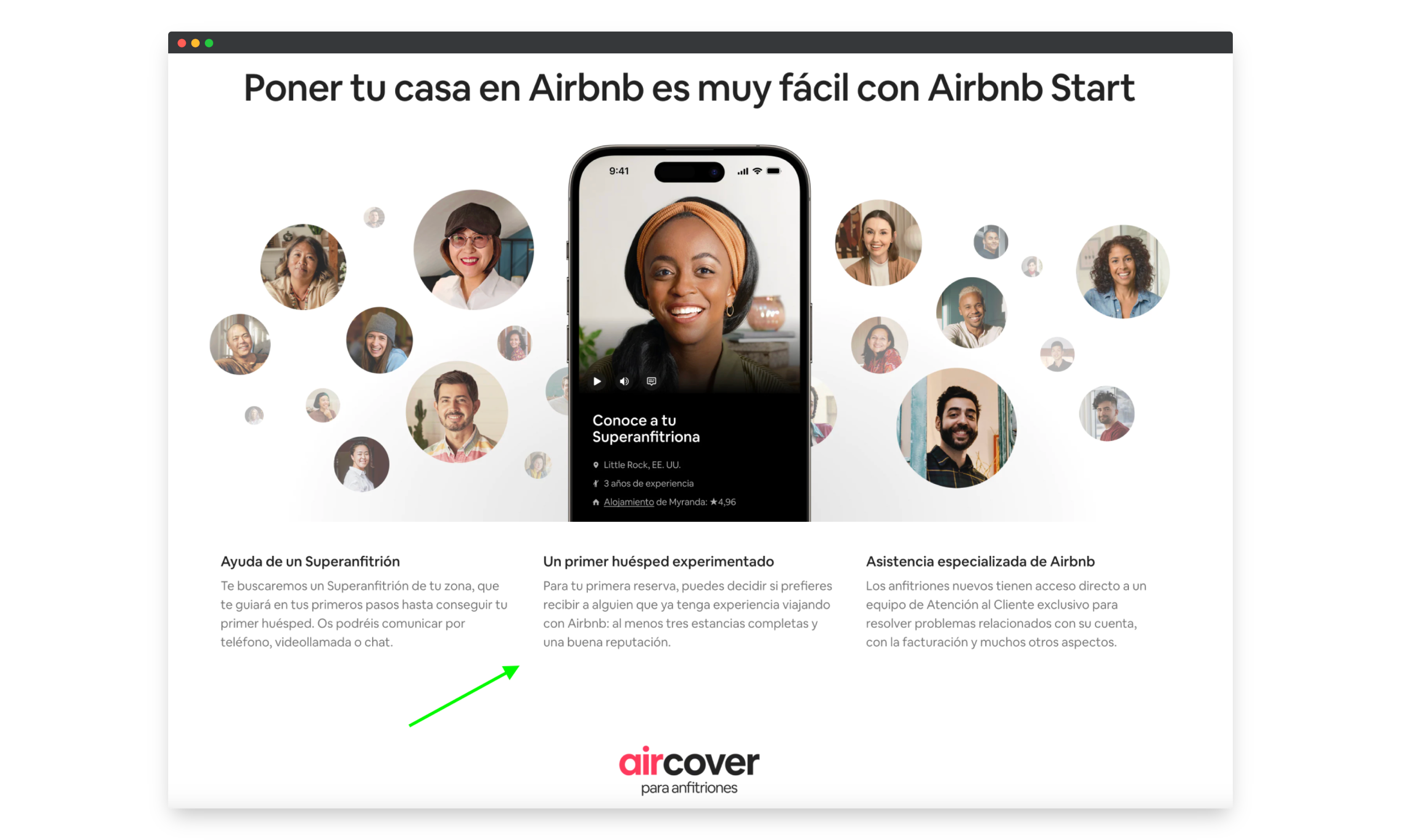
One company that works very well on landing pages is Airbnb, as we can see on its page to turn visitors into hosts. These reasons are:
**- Clear and attractive message: ** There is no better way to convince a user than to clearly and directly show them the economic benefit they could obtain.
**- Featured call to action: ** The call to action is in a highly visible and prominent position with the main color to encourage the page visitor to “Get Started”.
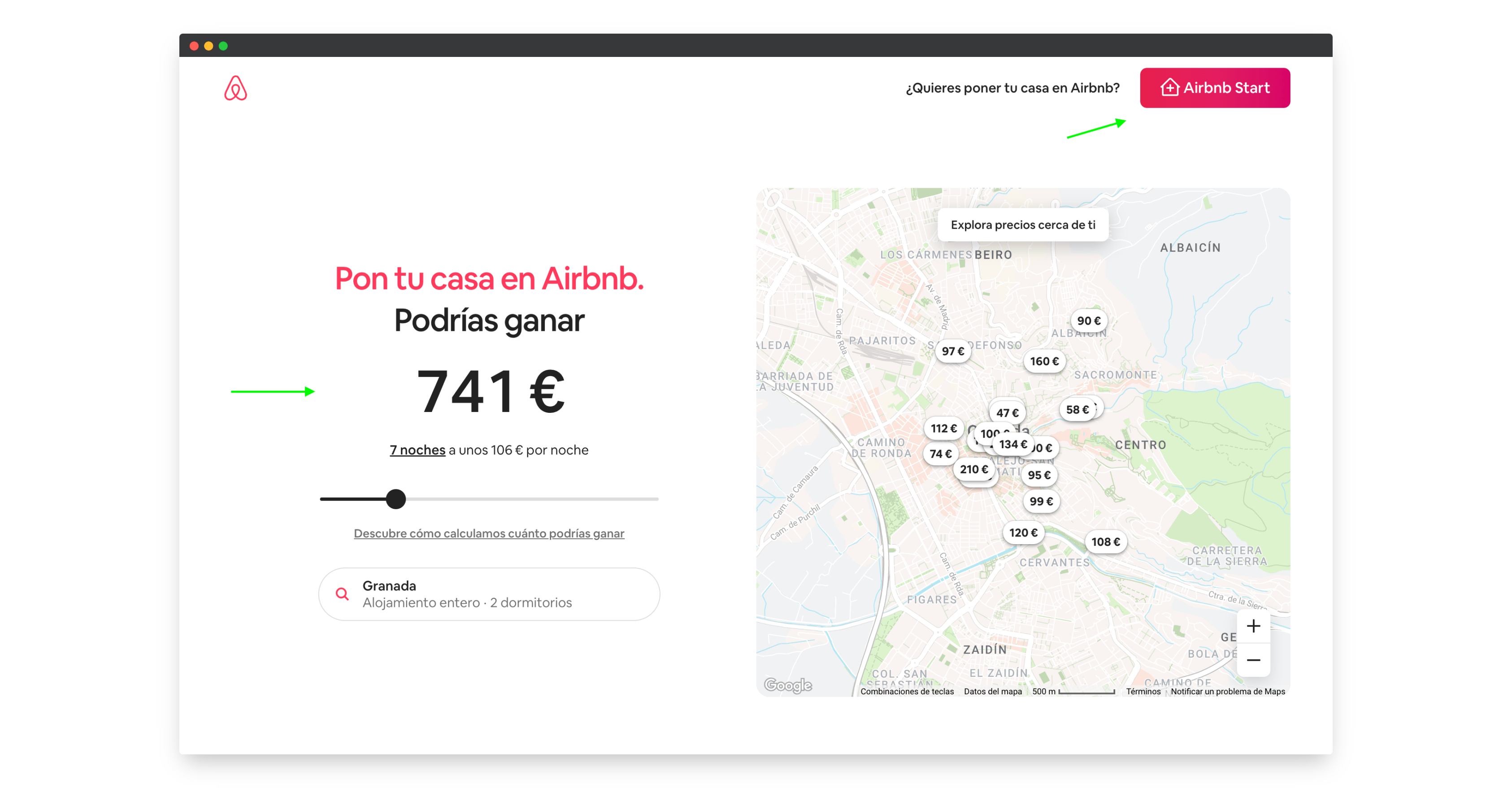
**- Important information and images of happy users: ** The page includes the most important information about the process of becoming a host, including how it works, the method for calculating prices, security policies, etc... This promotes understanding and, together with the appearance of images of happy users, encourages them to take the plunge.
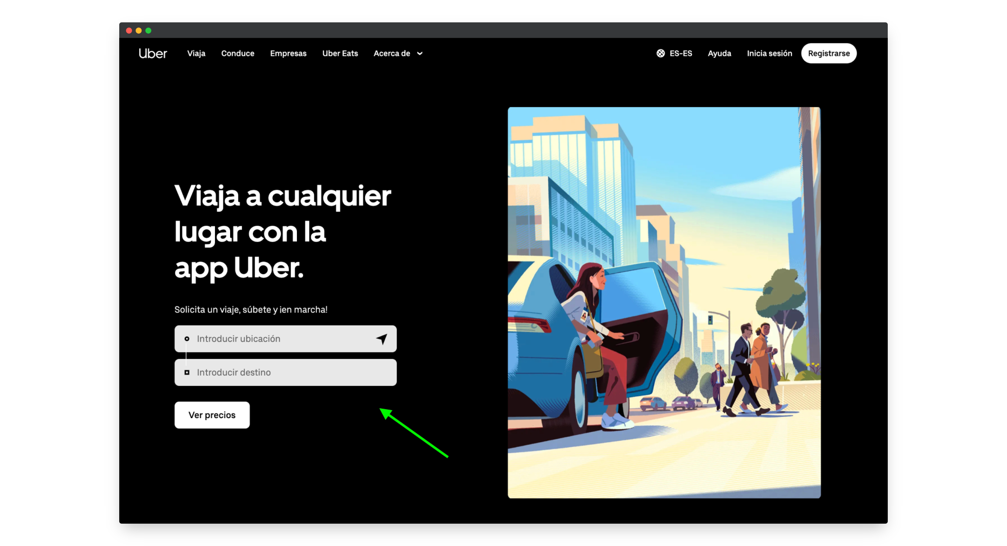
Uber is another leading company in terms of technology and how to offer an excellent user experience. On their landing page we can also find highlights such as:
**- Attractive and functional design: ** It highlights calls to action very well, thanks to the perfect use of spaces and color contrast, and this in turn makes navigation much easier.
**- Social, striking and quality images: ** Another aspect to highlight is the good use of images, which in this case are illustrations that represent happy users of the service in an innovative and original way, very much in line with the image that the brand wants to project.
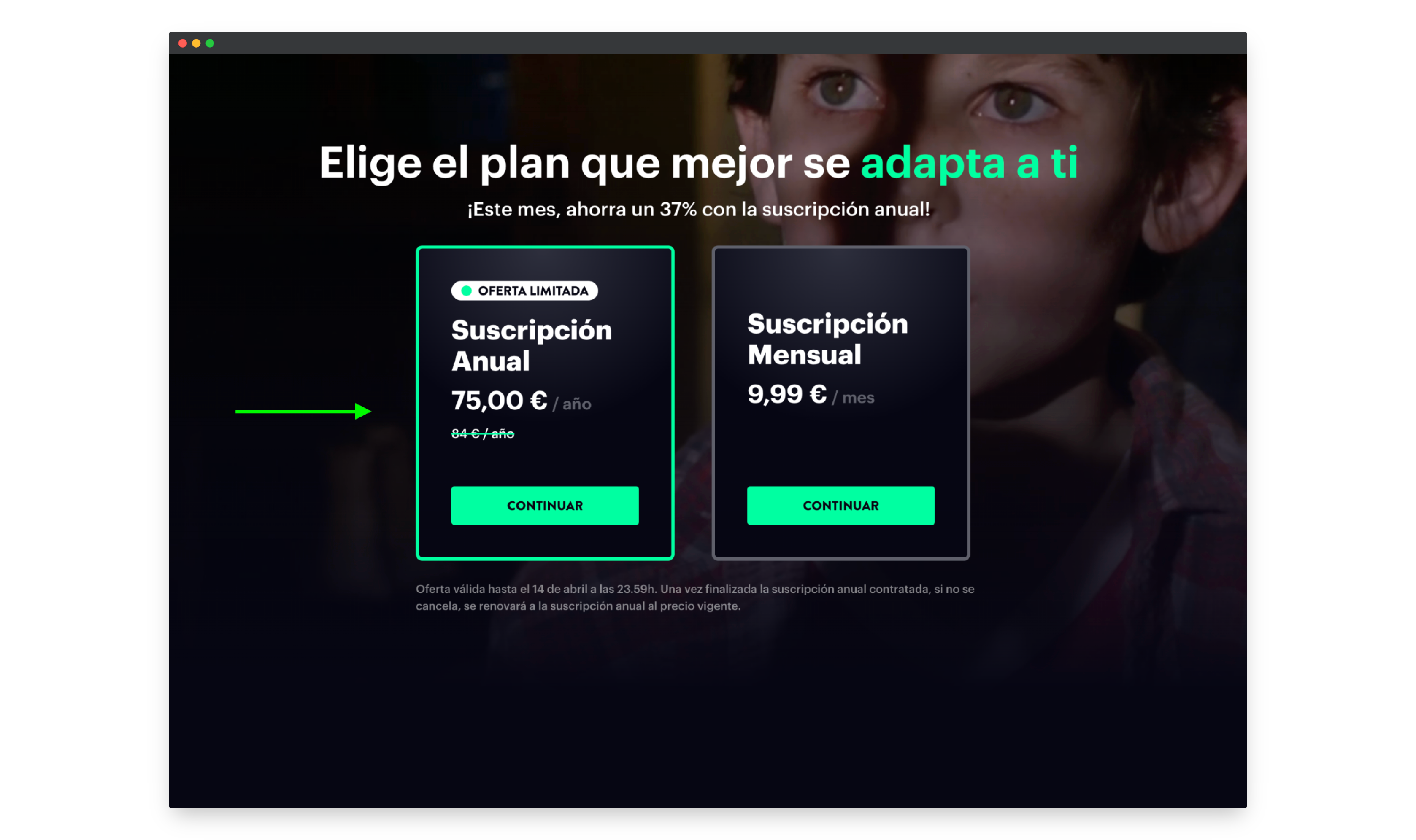
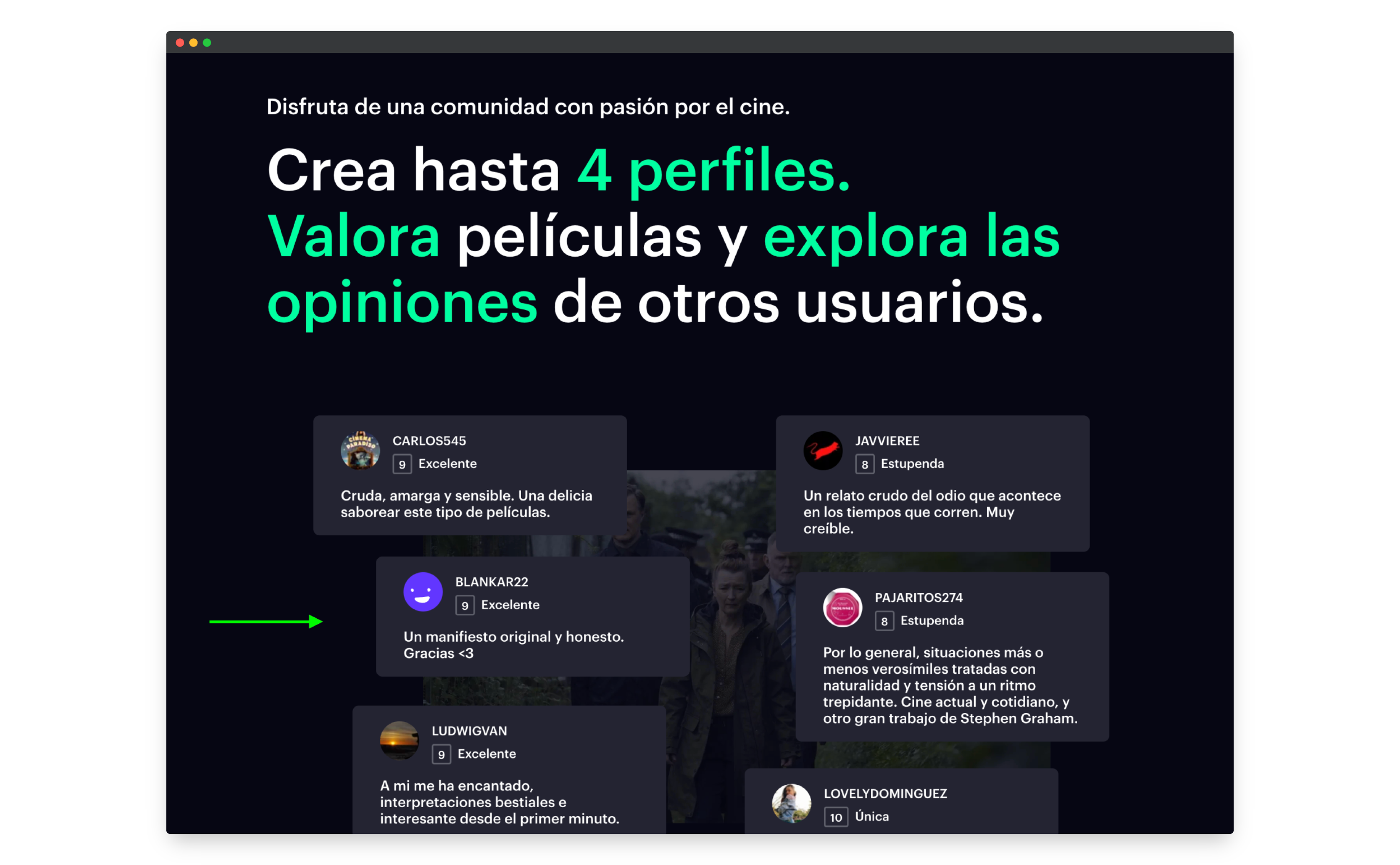
On the Filmin landing page, we can see several elements that allow them to increase their number of subscriptions considerably, these are:
**- Clear purpose at the top: ** We see very clearly, without distractions and in the first position the purpose of filmin, especially highlighting the one that is most interesting for the company with a good use of text, shapes and color.
**- Presence of testimonials and reviews: ** We can also find social proof through the appearance of testimonials and user reviews, which implies an increase in trust and credibility in potential customers.
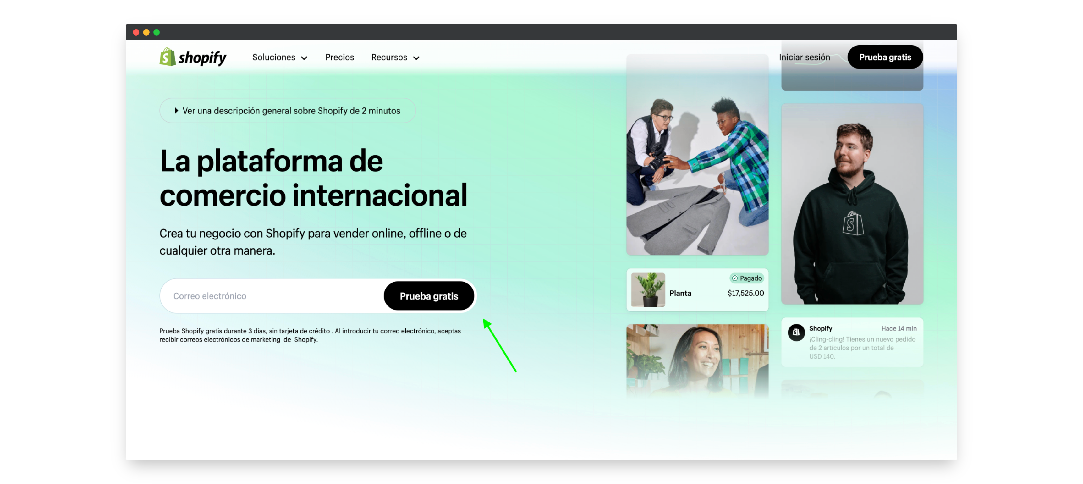
The Shopify landing page effectively brings together several of the features that we have mentioned to consider in order to be successful in attracting customers, such as:
**- Direct message and value proposition: ** The first thing we find on the page is a direct message that invites us to enter our e-mail in a placeholder, highlighted on the left side where we started reading, to get a free trial. At the same time, it is accompanied on the right side by positive data and images of satisfied users who are already enjoying the advantages of its services. This strategy and composition of the elements in the design is very effective in achieving a great capture of leads.
**- Videos of success stories: ** Another practice with which good results are obtained is the appearance of videos of success stories, which awaken empathy in users, enhance credibility and are very useful for calling for action.
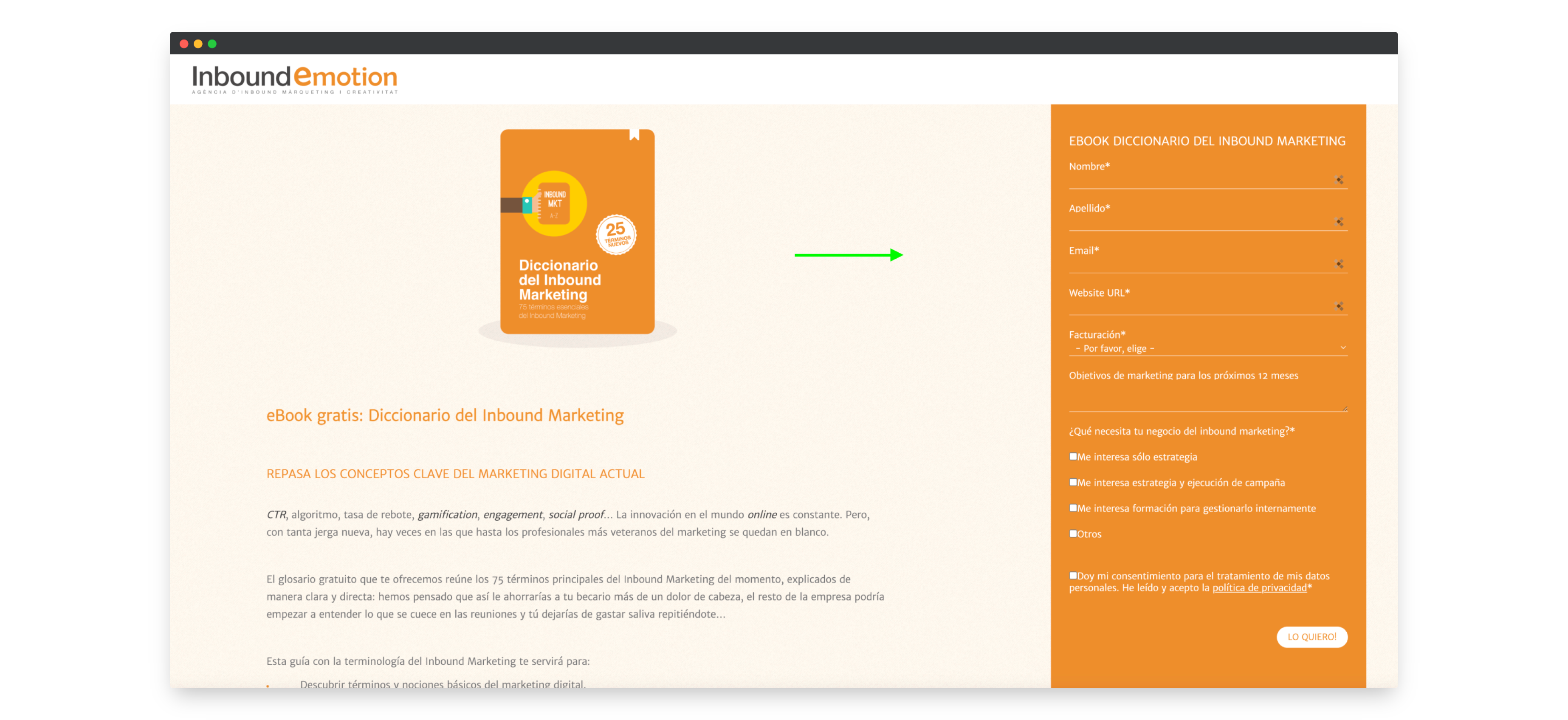
In this example of Inbound Emotion, I show a specific landing page whose primary objective is to capture leads through a form offering a free downloadable book as a reward. The positive aspects of this page are:
**- Good distribution of the elements: ** We see that in the upper left part where we started viewing the web we first have the image and description of the book, highlighting the benefits that reading it will bring us, in order to convince us that then on the right side it will be worth completing and sending the form to receive it free of charge.
**- Clear call to action: ** The form from which they will receive all the information they want to capture from their target audience is highlighted in the main color with a fixed position when you scroll and a language that encourages decision-making.
After seeing some of the peculiarities of this type of page and in summary mode, I wanted to highlight the main benefits we achieve with them, such as transmitting a direct and optimized message, boosting the increase of subscribers or buyers, facilitating the analysis and monitoring of traffic and sending a more segmented message.
Finally, to say that I hope I have served as an inspiration and that you will take advantage of the tips in this post to create your landing page once you have clearly defined your objective.
También te puede gustar
000 THECOOKIES Terminal v1.0
Type your email to start a conversation with our AI assistant.
────────────────────────────────────────────────────────